What is responsive design or RWD?
“Responsive design (often abbreviated to RWD) is an approach to web design in which a site is crafted to provide an optimal viewing experience—easy reading and navigation with a minimum of resizing, panning, and scrolling—across a wide range of devices (from desktop computer monitors to mobile phones).
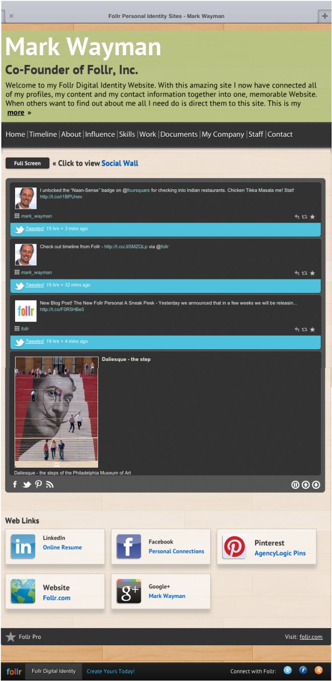
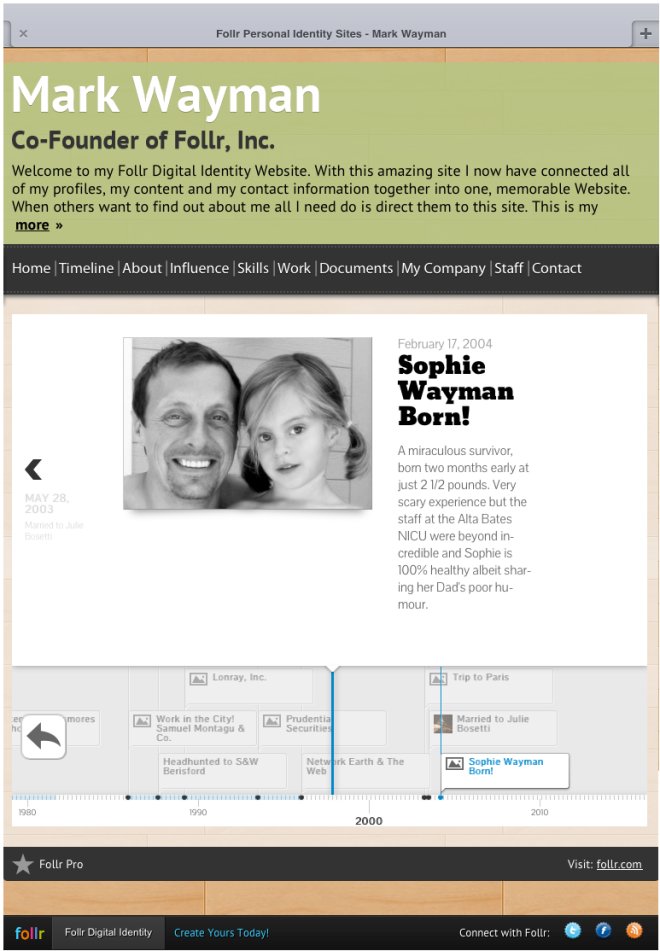
When you consider just how much mobile dominates peoples attention the time is rapidly approaching when we spend more time on our phone than watching TV. As a result the importance of having Web content present effectively on mobiles and tablets can’t be understated. So we have made sure that every Follr Personal Profile Website looks as good as it can on every phone:

And here is now it will look on an iPad:

The default information displayed can be changed so you have the choice of highlighting your Social Wall, links or Timeline:

We will continue to post details on other aspects of Follr via this blog. Please let us know what you think!
